So I had this idea for our front porch this year that I had been holding onto for like a year that I got from Country Living magazine. Here is the page I ripped out from the magazine hanging on my bulletin board.
Cute, right? I loved how simple and cute it was. But when I finally got it all put together on our porch, I wasn't really feeling it. I don't know if it was because our house is not white like in the picture or that it wasn't exactly the same or what, but once I set it up, I just didn't like it. Here are pictures of what it looked like.
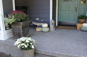
So I left it up for like a week and when I still didn't like it, I decided to start all over again. I switched out the red apples in the wreath for white pumpkins and added some faux greenery for a little drama. Then I took away the pears and apples (which I felt kind of clashed with our new house paint color) and replaced them with some of my favorite colored pumpkins. I love the white pumpkins of course and those light green ones are pretty much made for me.....I mean look at them, they match my front door! Then I went to the nursery and picked out some mums for a little bit of Fall color. This purple-y color of mums are some of my favorite and I think they actually go well with the colors I ended up going with and the house color.
I love this look much better and I am so glad I decided to switch it out. What do you think?
My neighbor caught me a few times taking pictures of the house and I think at this point, she thinks I'm a total crazy....."Why the heck does she keep taking pictures of her front porch?".
These planters on the right have gotten such a cool aged look over the years, but unfortunately I think we need to replace them next Spring. When the painters moved them, the entire bottoms fell off. It's a miracle all the dirt and plants didn't fall out too.
I got these cute galvanized buckets at an antique shop and I love how they look with the mums planted in them. Like really. So cute!
Anyway, that's our front porch decorated two different ways for Fall. I love what we ended up with. Which way do you like best? The traditional Fall colors or neutrals? As always, shoot me a comment or question any time!
Pages
▼
Thursday, September 28, 2017
Wednesday, September 27, 2017
Fall Living Room
Good Morning Friends!
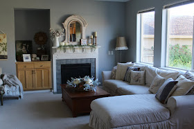
Even though the weather hasn't been consistently reading Fall, it is Fall! And gosh darn it, I am not going to let a little 80 degree weather deter me from putting up my pumpkins! We've passed the first day of Fall (It was September 22nd) so I thought it was about time to show you the Fall touches I have put around the house. So grab your cup of coffee or tea and get ready for some Fall inspiration. Today we will start with the living room. I love to use neutral colors, especially in early Fall because soon enough, the orange and black will be taking over.
I took a lot of inspiration from Liz Marie Galvan at Lizmarieblog.com and Erin at Cottonstem.com. I follow their blogs and their Instagram accounts and I am obsessed. Although that might be a slight understatement because as my husband would tell you, I can't get through the day without watching Erin's (at Cotton Stem) Instastories. Or as she once called it, "Erin TV". You can keep your Real Housewives, and Bachelorette. My guilty pleasure is following Erin on Instagram.....like a creeper. They are both amazing accounts and if you don't already, you should follow them.
This white pumpkin centerpiece is the perfect LizMarie/CottonStem hybrid. Erin had the brilliant idea of using her copper pieces as "pumpkins" this year and it is so pretty. Plus I love any opportunity to use my pretty copper pieces around the house.
I found this little "Hello Fall" sign at Micheal's and even though it is not the typical neutral color I used throughout, I thought it was a nice subtle pop of Fall color. With a little faux greenery and some white pumpkins, it's perfect for the mantle.
I love this cozy corner. I recently made that botanical hanging print and I have a few more that I want to put up in the house, so I am thinking I will do a tutorial for it soon. It's so easy.
I am working on switching out my couch pillows to all soft creamy, neutral colors. I am going to try and get them all to be the same cream color, but with lots of varying texture. It requires me pulling out my sewing machine though, so it's been a work in progress.
In my entryway post that I did last week, I used this little window cutout that we have to take a picture and I think it is such a good spot for this angle of the room. I hate the window cutouts, because they never look right to me, but at least they are good for something!
That's all for today. Hope it got you in the Fall spirit! As always, if you have any questions, leave me a comment below and I will be happy to answer.
Thursday, September 21, 2017
Entryway Redo
Hello friends!
It's been a long time, did you miss me? If you followed my blog before you probably thought that I would never blog again. SURPRISE! The last post I did was in March of 2016! Well over a year ago. I felt like I needed a break from blogging as I started to feel more pressure than pleasure from it and decided that since that wasn't the point, I should stop for awhile. Then after being so long away from it, I started to worry that I couldn't do it again. Then I started to really miss it and decided that I want this. I love the creative outlet that it gives me and I love being able to write, even if no one reads it. I am lucky that my regular job has slowed down to 2 days a week and I will have more time to do things for myself and my sanity....like blogging! I probably won't do it as much as I did before, so that it continues to be something enjoyable for me. But I would like to try for a few posts a week to share projects, crafts, ideas and home decorating with you all as these are things that I really enjoy doing and would love to share and hopefully inspire others. Anyway, that's my story and would love for you to follow along!
We recently redid our front entryway and I wanted to share with you what it looks like now. But first, here are a few before photos to remind you of what it looked like pre-redo. The only pictures I could find were from birthdays, but you get the idea.
BEFORE:
So normally it had that lamp, which was one of my very first blog posts! And that old window on top with family pictures displayed. It was a great little hutch to have as a drop spot for keys and such....but it drove me crazy when it was piled up with stuff and the hutch itself seemed too small for the wall. I originally wanted to do a longer entry table, maybe with baskets underneath and bigger lamps up top. But then I decided I wanted something that would be a little more utilitarian for the space. So I thought up doing a bench with a shelf/cubby over it as a sort of shoe putting on/school drop zone/mud-room type spot. Here is what we did.
AFTER:
It actually proved to be a very hard spot to photograph straight on, so all the pictures are at an angle, but anyway, I love the way it turned out.
I am really excited to play around with the decor for the cubbies throughout the seasons. I mean, come on, Christmas!? It will be so fun.
For now I kept it pretty simple and clean with the decor and of course added a few Fall touches.
This is the best straight-on shot I could get. I took it from inside the little window opening in our living room. It kind of helps to see the whole space.
If anyone was wondering, we did still keep the hutch. I put it where I used to have the bench, outside the office. It seems to fit there really well.
The shoe bin will not stay there. I am working on finding some basket/bins to go underneath the bench, because it makes more sense for our shoes to go there, but it's hard finding the perfect ones that fit!
I have been waiting for a perfect spot to put that sheep art that I picked up driving through wine country on the way to my sister's wedding last year and I think I found it. As you know our last name is Shephard, so sheep have a special place in our hearts. I tried to keep it pretty simple on the hutch as well, because most of the time that ends up being a huge drop zone for receipts, papers, keys, etc.
And here is it in relationship to the bench.
So that's our entryway redo. Hope you enjoyed! I will list all sources below.
White Bench: I bought two of them at a garage sale a few years ago and painted one white. The other one resides on our front porch. I just did a quick search and found this bench here. If you wanted it to look like mine, you could easily throw some paint on it. But I bet there are more options out there that are closer.
Large basket: Crate and Barrel
Cubby/Shelf with hooks: Target. You can shop it here.
Pumpkins: Micheal's and Joann Fabrics.
White blanket: Target
White and black blanket: Ruddy Duck (In Hood River, OR)
Chocolate furry blanket: Pottery Barn you can shop these blankets here.
Books: Vintage finds
Mercury glass vase: Old candle container from Target
Galvanized bucket and greens: Micheal's
Large blue demijohn (blue vase): Painted Fox Home. You can find it here. I got the XL size.
Faux Hops flowers: Molbak's
Heart Sign: Micheal's
Pillows: The large one I made and the olive oil one is from Linen and Ivory. The owner of the shop is local to me and I love her pillows. She has some beautiful new botanical ones for Fall.
Two white flower pots: IKEA
As always I am here for any questions or comments you may have! Be sure to follow me on Instagram for more photos and "a day in the life of Brooke" type things and Pinterest for where I find lots of inspiration.
Hope you have a wonderful day!
It's been a long time, did you miss me? If you followed my blog before you probably thought that I would never blog again. SURPRISE! The last post I did was in March of 2016! Well over a year ago. I felt like I needed a break from blogging as I started to feel more pressure than pleasure from it and decided that since that wasn't the point, I should stop for awhile. Then after being so long away from it, I started to worry that I couldn't do it again. Then I started to really miss it and decided that I want this. I love the creative outlet that it gives me and I love being able to write, even if no one reads it. I am lucky that my regular job has slowed down to 2 days a week and I will have more time to do things for myself and my sanity....like blogging! I probably won't do it as much as I did before, so that it continues to be something enjoyable for me. But I would like to try for a few posts a week to share projects, crafts, ideas and home decorating with you all as these are things that I really enjoy doing and would love to share and hopefully inspire others. Anyway, that's my story and would love for you to follow along!
We recently redid our front entryway and I wanted to share with you what it looks like now. But first, here are a few before photos to remind you of what it looked like pre-redo. The only pictures I could find were from birthdays, but you get the idea.
BEFORE:
So normally it had that lamp, which was one of my very first blog posts! And that old window on top with family pictures displayed. It was a great little hutch to have as a drop spot for keys and such....but it drove me crazy when it was piled up with stuff and the hutch itself seemed too small for the wall. I originally wanted to do a longer entry table, maybe with baskets underneath and bigger lamps up top. But then I decided I wanted something that would be a little more utilitarian for the space. So I thought up doing a bench with a shelf/cubby over it as a sort of shoe putting on/school drop zone/mud-room type spot. Here is what we did.
AFTER:
It actually proved to be a very hard spot to photograph straight on, so all the pictures are at an angle, but anyway, I love the way it turned out.
I am really excited to play around with the decor for the cubbies throughout the seasons. I mean, come on, Christmas!? It will be so fun.
For now I kept it pretty simple and clean with the decor and of course added a few Fall touches.
This is the best straight-on shot I could get. I took it from inside the little window opening in our living room. It kind of helps to see the whole space.
If anyone was wondering, we did still keep the hutch. I put it where I used to have the bench, outside the office. It seems to fit there really well.
The shoe bin will not stay there. I am working on finding some basket/bins to go underneath the bench, because it makes more sense for our shoes to go there, but it's hard finding the perfect ones that fit!
I have been waiting for a perfect spot to put that sheep art that I picked up driving through wine country on the way to my sister's wedding last year and I think I found it. As you know our last name is Shephard, so sheep have a special place in our hearts. I tried to keep it pretty simple on the hutch as well, because most of the time that ends up being a huge drop zone for receipts, papers, keys, etc.
And here is it in relationship to the bench.
So that's our entryway redo. Hope you enjoyed! I will list all sources below.
White Bench: I bought two of them at a garage sale a few years ago and painted one white. The other one resides on our front porch. I just did a quick search and found this bench here. If you wanted it to look like mine, you could easily throw some paint on it. But I bet there are more options out there that are closer.
Large basket: Crate and Barrel
Cubby/Shelf with hooks: Target. You can shop it here.
Pumpkins: Micheal's and Joann Fabrics.
White blanket: Target
White and black blanket: Ruddy Duck (In Hood River, OR)
Chocolate furry blanket: Pottery Barn you can shop these blankets here.
Books: Vintage finds
Mercury glass vase: Old candle container from Target
Galvanized bucket and greens: Micheal's
Large blue demijohn (blue vase): Painted Fox Home. You can find it here. I got the XL size.
Faux Hops flowers: Molbak's
Heart Sign: Micheal's
Pillows: The large one I made and the olive oil one is from Linen and Ivory. The owner of the shop is local to me and I love her pillows. She has some beautiful new botanical ones for Fall.
Two white flower pots: IKEA
As always I am here for any questions or comments you may have! Be sure to follow me on Instagram for more photos and "a day in the life of Brooke" type things and Pinterest for where I find lots of inspiration.
Hope you have a wonderful day!